Howdy!
We are a dedicated and friendly team that makes things happen. Our team delivers web applications, design solutions, and exceptional experiences.
Our passion for details makes all the difference. We will guide you through the journey of planning, developing, and thoroughly testing your product.
Core Values
Our Mission
Our Vision
Our journey: different. together.
When I decided to open my own business, I aimed for a name that wouldn’t restrict or pigeonhole the company’s scope, while also reflecting the values of cooperation and mutual support.
Having spent a considerable amount of time in Brazil, I settled on the name “comigo,” which translates to “with me” in Portuguese. I was drawn to its pleasing sound, simplicity, and its ability to bring a smile to my face.
I’m Yamit, a website Developer with 8 years experience and a Graphic Designer; Graduated from HIT (Holon Institute of Technology).
Before I started my independent way I have been employed (6 years) at ims ltd; Managing, creating and maintaining web-servers and websites and full custom themes.
I’m a translation expert UI/UX design wireframes to actual code.
And besides, I’m addicted to joy, vacations and fun.

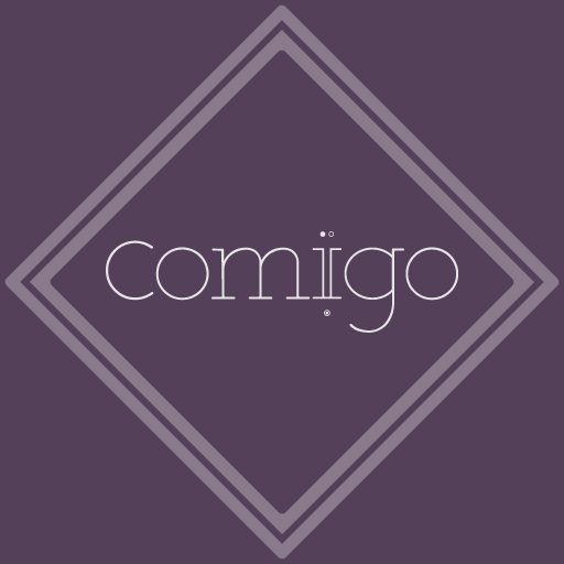
behind the logo
The heart of the name is the letter “i”.
Each of us has his own “I” believer.
And it is the main letter in my first name and I decided to make a way with it. which way And why does she have 2 points?
Those who walk with me – make a way with me, hand in hand, and those who know me know that there is no one above me and no one below me, and 2 points so that there is no point alone.
If it’s alone, how about me?
And why both above and below?
Before and after, there is a way – and it is expressed in the body of the i at the beginning of the way 2 splits that reach the point where the way ended – a kind of completion, a project that has come to an end, striving to complete the goal for which we gathered. Also, I decided to incorporate something more Hebrew/Israeli in the logo and in order to maintain correct punctuation in Hebrew, the 2 dots were connected to a shriek so that the reading of the word would remain correct.